Project Clean - Home
Created 3/27/2021 -
98141
- Home Menu
DarkCleanMinimal
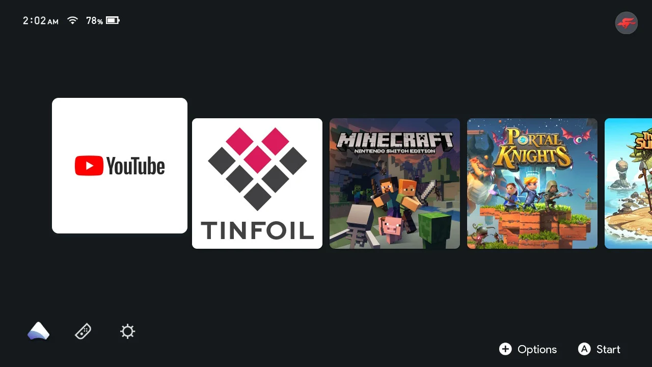
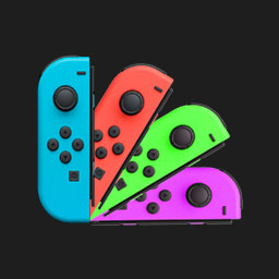
I designed this Home menu to be as minimal as possible while still keeping the few essentials. I removed the eshop, news, power button, etc but kept the Settings, Album, My Page, and Controller buttons. Only the first user is shown the others are hidden. I also changed the album icon to the Atmosphere logo and is multicolored instead of just white or a single color.
 T9A6
T9A6